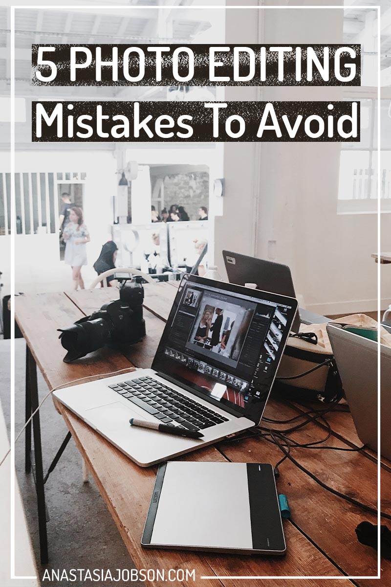
5 Worst Photo Editing Mistakes to Avoid
I’ve been into photography for many years, It all started with a documentary photography course at my university. Back then I was told, less editing is better (and of course I didn’t listen!). I loved to get creative in post production – I didn’t take the advice! So I went forward regardless and made my photo editing mistakes.
Today, reflecting on my early work I’m horrified by some of the edits. I learned the hard way: by over-editing my images and burning the bridges (deleting the RAW files)… If you learn just one thing from this blog post, let it be this one. Never delete the RAW files of your favourite images. The chances are you will look at a photo again in a month/year with a strong desire to re-edit, so make sure you can go back. Keep the RAW files!
Revisiting your old work and editing it again is a great exercise to improve your photography. HERE you can learn about other creative ways to work on your skills.
Top 5 worst photo editing mistakes I was guilty of:
Skin colour
If you’re playing with saturation/contrast/colour-toning and other settings that might affect natural looking complexion, be careful to not overdo it.
When I was just starting out, people in my photos used to look like KFC fried chicken, or the walking dead if I shot at night or club setting. Please don’t make my mistakes.
Think of a skin colour as your baseline. While you experiment with colour hues and tints of a model’s surroundings, clothes, props, try to preserve the natural skin tone. No model would not like to see themselves with some added fake tan (unless that’s what they want).
Clarity slider
I know, the truth hurts. If your photo didn’t come out sharp, clarity slider won’t magically sharpen it. What clarity actually does is counter undesirable softness on the image, making it appear more defined.
Clarity works similarly to contrast, but instead of affecting highlights and shadows (what contrast does), it targets mid-tones and local areas of the image (edges).
A subtle increase in clarity can enhance almost any image. For instance images with lots of texture can benefit from a slight boost of clarity to make the texture and detail pop.
With that being said, be mindful when using clarity slider when editing faces. The reason why you don’t want to overdo it is that it’s simply not flattering (especially for feminine faces). Clarity slider defines skin imperfections and blemishes. While some men will be okay with this type of photo edit, female models won’t thank you for that.
Contrast
As I mentioned earlier, contrast affects highlights and shadows. However, when you increase contrast, saturation also increases.
I used to love contrast slider and was overdoing it massively, until I started to have my images printed.
It was a big slap to my face when I realised that none of my photos looked good in print, including my business cards! I ordered black and white cards with one of my images on it – it sucked. It looked 2D, with no mid-tones and shadows whatsoever. Also, keep in mind that printing adds to contrast and if an image looks dark already on your computer screen, in print it might loose all the detail in the shadows and end up looking pitch-black.
After this experience I don’t touch the contrast slider at all. Ever.
Using Presets
Way back in the day, I used to just throw some basic-bitch presets I downloaded for free from the web. I slapped them on top of my images as filters like a 13-year old on Instagram, I didn’t change anything, I thought it was ready to go… (the shame).
Little did I know, you need to adjust every preset to your particular image. Tweak a few settings so it corroborates with the exposure and contrast level of your photo. Not only does it look good – you can pretend to know what you’re doing!
Colour Calibration
Did you know that no-one else sees exactly the same image that you see on your screen. When you post your photos online, people might view them on their phones, tablets, laptops or super expensive fancy-pants monitors.
About a year ago I was putting my website together. I was cross checking how the outline of the images in my portfolio looked on 2 computer separate computer screens. Long story short, after I edited the photos on my old MacBook Air, uploaded to my website and viewed them on another computer monitor, I was shocked. The images looked absolutely awful: orange faces, oversaturated sky and grass, or deadly blue/green hues on desaturated people’s faces… (What is this – amateur hour!?)
What you can do to make sure your images look great on the majority of screens, is to edit your images on a colour calibrated monitor.
If you can, invest in a colour calibrated computer monitor, or you can also get a tool to calibrate your existing monitor.
To check if your monitor is showing true colours, print your images you’ve edited on this specific monitor. Place your print against the same image on the monitor and you will see the difference – if your screen is fooling you (‘these hues ain’t loyal’).
In conclusion, less is more. Edited photos don’t always have to be dramatic. Editing can be as simple as changing white balance (from “as shot” to “auto”); or a quick skin retouch. By editing less you will also save your precious time 😉
What are the worst photo editing mistakes you made when you were starting out? Share in the comment section below.
Sorry, the comment form is closed at this time.